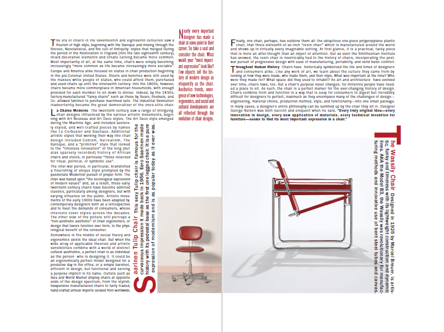
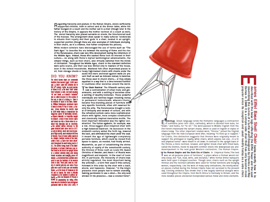
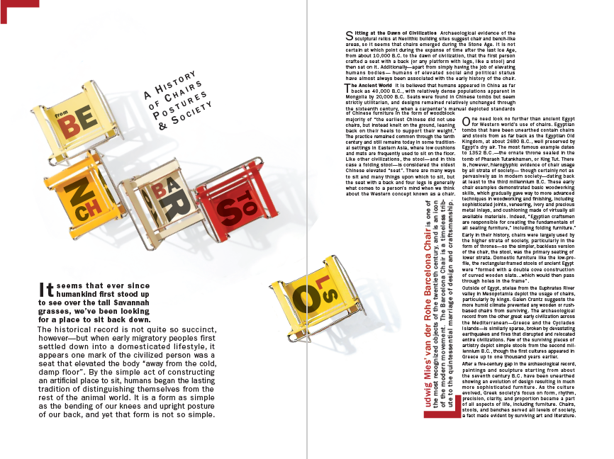
This three spread magazine layout is a good example of my work in combining typography with images and image manipulation in a modern aesthetic. Utilizing shapes, repetition, directional flow and negative space to create a specific mood and interest in content. This was a solo project with images chosen by me from stock photography.


